library(here)

# Calling my data, and calling any empty cells N/A
sg_initial <- read.csv("pplatt_storygraph.csv", na.strings = c("", "NA"))

#| message: false
#| warning: false
library(tidyverse)
library(dplyr)

# Changing cells with multiple moods into multiple rows with one mood
new_sg <- sg_initial %>%
  separate_rows(Moods, sep = ",") %>%
  mutate(Moods = trimws(Moods))

# Removing the two rows of X that simply have NAs
sg_noXrow<-select(new_sg, -X, -X.1)

# Removing rows that have NA in the Moods column, aka all books read before 2024
sg_clear <- sg_noXrow %>% na.omit()pplatt_q
Data Origins
This data is loaded from Storygraph, an app that tracks reading habits. I used my own data from 2024-2026, which is how long I have been actively tracking what I read. This data was exported from my account, and can be found at this link: pplatt_storygraph.csv as an excel spreadsheet that can be imported into r.
The data contains book title, author, dates read, moods and rating out of 5 stars.
Research Question
Storygraph tracks multiple variables about books logged. One of the most interesting variables is ‘Moods’. This variable contains several themes, e.g adventurous, sad, relaxing, etc. that when reviewing books you can add to your profile of that book, to illustrate the feel of it. As I read a wide range of books, I was curious to see which moods appeared the most in my profile, and what I rated books that had these moods.
Therefore this visualisation attempts to look at the moods of books I read plotted against how many stars I rated books that had these moods. This is conceived as a heatmap, where tile colour represents the frequency of this rating being given to that particular mood.
Preparing my data
For this project you will need the following packages: tidyverse, dplyr and plotly.
This data has now been loaded and cleaned of N/As.
Empty cells are labelled N/A when called into R.
Entries with multiple moods are then duplicated so one cell with multiple moods is transformed into multiple cells with one mood.
Two empty rows are removed.
All data from before 2024 (entries with no moods listed) are removed.
This is what the first few rows look like now:
head(sg_clear)# A tibble: 6 × 5
Title Authors Dates.Read Moods Star.Rating
<chr> <chr> <chr> <chr> <dbl>
1 Orbital Samantha Harvey 2025/08/01-2025/08/02 adve… 5
2 Orbital Samantha Harvey 2025/08/01-2025/08/02 emot… 5
3 Orbital Samantha Harvey 2025/08/01-2025/08/02 hope… 5
4 Orbital Samantha Harvey 2025/08/01-2025/08/02 insp… 5
5 Orbital Samantha Harvey 2025/08/01-2025/08/02 refl… 5
6 The Sense of an Ending Julian Barnes 2025/11/06-2025/11/06 emot… 3Visualizing my data
To create my heatmap, the data is reduced to three columns: Moods, Star rating and count. The new column ‘count’ shows the frequency of that mood being rated that many stars. This allows me to plot my heatmap with tile colour representing a value.
# Creating a new dataset with Moods, Star rating, and how many stars I gave moods.
sg_count <-
  sg_clear %>%
  group_by(Moods,Star.Rating) %>%
  summarise(count = n())


# Creating heatmap
moods_heatmap <- sg_count %>%
  ggplot(mapping = aes(x = Star.Rating, y = Moods, fill = count)) +
  geom_tile() +
  scale_fill_viridis_c(option = "rocket") + #colour package
  labs(title = "Heatmap of Moods by Star rating",
       subtitle = "Moods coloured by frequency of rating",
       x = "Rating out of 5 stars", y = "Mood", fill = "Frequency") +
  theme(axis.text.y = element_text(size = 6))


moods_heatmap # Calling my heatmap to see what it initially looks like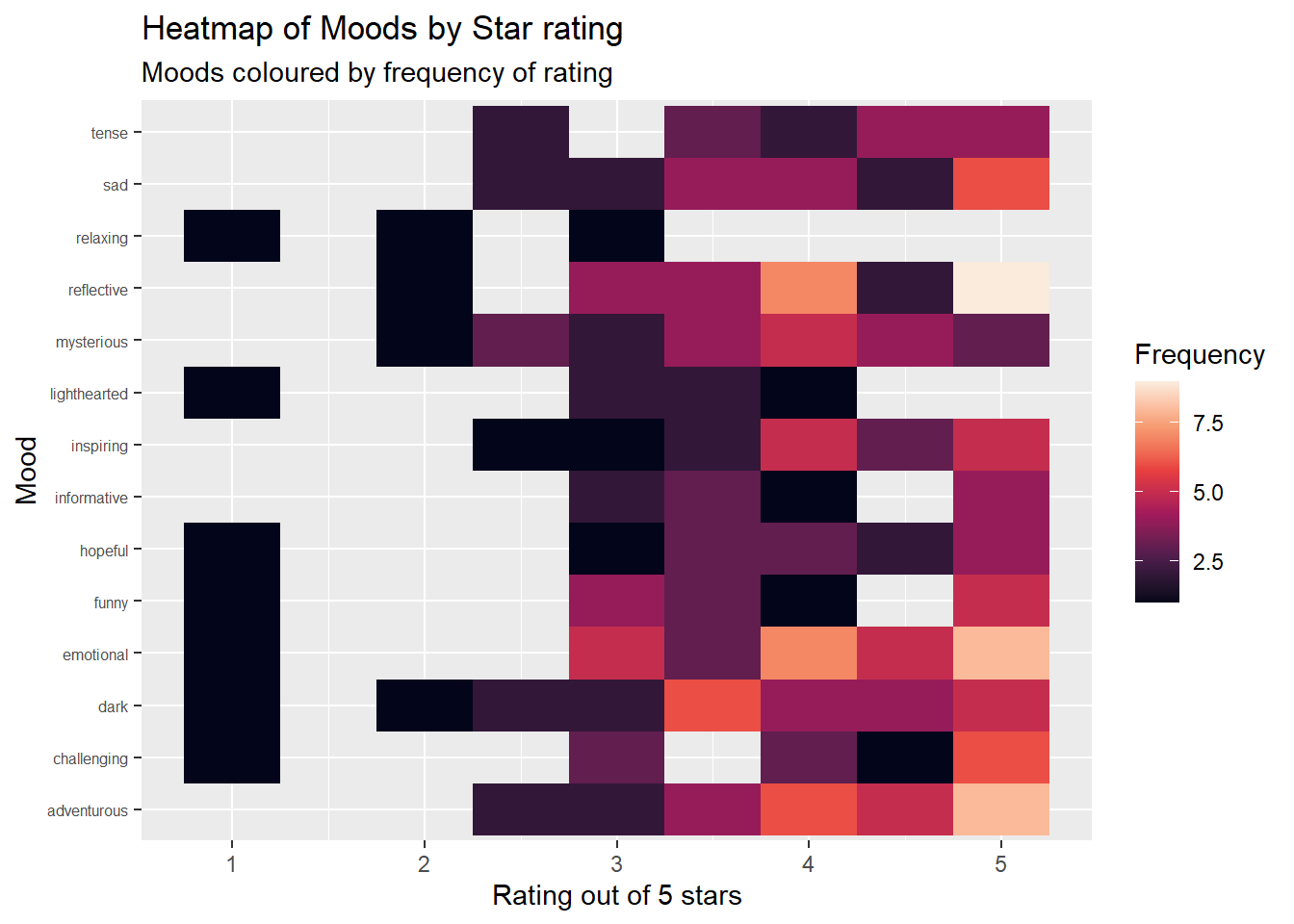
Final Visualisation
This final plot is also interactive, so hovering over tiles gives a number of books rated, instead of relying on the colour scale entirely. This means that not only can you understand immediately any trends by simply looking at the colours displayed, but can also gain a more concrete understanding by viewing the exact number.
library(plotly) # Calling plotly

ggplotly(moods_heatmap) # Making the graph interactive: now you can hover over tiles to understand how many books were ratied this number of stars.
Summary
This data showed me that the moods I rated most highly were ‘Adventurous’ and ‘Emotional’, as these have the highest counts on the 5 star point. The lowest scoring mood was ‘Relaxing’, as it has no ratings above 3 stars. With more data and time, I would like to have compared these ratings with a cleaned version of the variable Date.Read, to understand if my approach to different moods changed across time.